
What I think about color harmony is like building relationships.
"All colors are the friends of their neighbors and the lovers of their opposites." - Marc Chagall
As I mentioned in previous article, every color has different personalities.
We have to understand the meaning of color, be willing to try different combination and enjoy playing with color.
In this article, I will both introduce color theory and give lots of examples.
In the beginning, just tell me what do you think about these website?
Constellation

Water Equipment Technology


How do you feel about looking at these websites?
Probably you feel the same way as me: tired and irritated.
Why?
Remember, colors are just like people. If we want to build a effective team, there should be a good balance of skills, abilities and aspirations. The balance introversion and extroversion can affect how teams work.
These colors they all want to be the main character. However, they just end up causing annoyance instead of more positive feelings. There are too many and too much which tire our eyes very quickly.
- Too many: Too many colors make users can't focus. Lots of hues confuse the eye, so readers don’t know where to start first.
- Too much: Too bright, too saturated colors distract visitor's attention and make dizziness.
So, what's a good color combination?
Remember, there's no best design. You can play with colors and try out different tones.
First of all, you should know what's the goal of your website.
what kind of message you would like to convey?
what kind of message you would like to convey?
Is it mature or just for fun?
Then, it's the time to start your design.
The color theory is not sth you "must" follow. However, it's a wisdom people tried thousands time before. There's must a reason to exist. Let's take a quick look :)
1. Monochromatic: derived from a single base hue and extended using its shades, tones and tints.


BACARDI ( I love this website a lot, beautiful UX/UI design )

Monochromatic is pretty easy to understand, you can just pick a color and can add white, gray and black on it. If you're a beginner, you could start from here to easily create harmony.
From my point of view, I really like Monochromatic scene. It's elegant and cohesive.
As the examples shown, The blue makes Si Le Soleil look calm. The red is perfectly create an mysterious atmosphere for BACARDI.
However, sometimes Monochromatic can be boring. Therefore, in addition to a single color, the shapes, the pictures, the icons, the fonts should be carefully designed.
2. Analogous: colors that are next to each other on the color wheel.

NASA Prospect

Tenslife

For example, both warm and cool color are included in Analogous scheme. Analogous color combinations are found frequently in nature. That's why we feel comfortable about this color scheme. It can be exciting and gentle.
If you are designing a website, in most cases you will use the main dominant, bold or primary color for your headlines, the lightest color for backgrounds and the midtown color as an accent color.
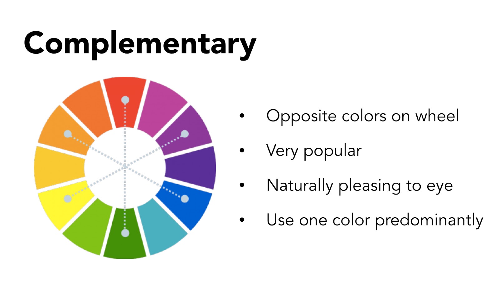
3. Complementary: Two colors on opposite sides of the color wheel.
TCM - summer under the stars

SpreeConf NYC 2013

The three traditional sets of complimentary colors are
red and green,
yellow and purple,
and orange and blue.
You can see them positioned opposite one another on the color wheel above.
red and green,
yellow and purple,
and orange and blue.
You can see them positioned opposite one another on the color wheel above.
Complementary colors, when used correctly, liven up a image in a way that's also dynamic and pleasing to the eye. A combination of two complimentary colors may be perceived as soothing or balanced, since it simultaneously stimulates different parts of the eye.
Blue and orange are my favorite of complementary color matchups. The warm orange seems to pop up of the page. If you use light blue paired with a bright orange, it's playful, fresh and bold.
A successful complementary color scheme requires a careful balance of daring and moderation, but when done right, the effect can be both tasteful and exciting. The tip is using one of the colors in large quantity but at a low intensity.
4. Triads: it includes 3 colors that are equally spaced from each on the color
Tetradic: a combination of four colors, determined by a square or rectangle placed over the color wheel. (based on two complementary pairs)

Lorenzo Verzini

Helback Ceramic

LA Web Agency

Triadic color combination is a popular color scheme because it has strong visual contrast and balance without being too overpowering. There maybe one or two colors that are dominate with the others used as secondary or accent colors.
As you can see in the first example, Blue is the dominant color. The designer lightens and desaturates yellow and red to let blue become the main role of this page.
Tetradic color schemes are also known as Double Complementary because they combine two sets of Complementary colors. Known as the richest of color schemes it is also the hardest to achieve balance and harmony. When using this color scheme chose one color to dominate and keep the others in more subdued tones, avoiding using pure colors in equal amounts.
"All colors are the friends of their neighbors and the lovers of their opposites." - Marc Chagall
In this article, I give bad examples and nice examples of web design. Hope everyone enjoy playing with color. Next, we will discuss the trend and tools. Have a wonderful weekend!
References:
1. 10 Color Theory Basics Everyone Should Know (recommended)
2. Monochromatic Color: How to Use It Effectively
3. How To Design With Monochromatic Colors (recommended)
4. Designing with analogous colors
5. 5 Common Film Color Schemes – Learning Cinematic Color Design (recommended)
6. Delight the Eye With a Complementary Color Scheme
7. Color Theory 101: Making Complementary Colors Work for You
8. Triadic and Tetradic
9. Hues, Tints, Tones and Shades: What’s the Difference? (recommended)
Comments
Post a Comment